CSS3 border-radius
CSS3 border-radius可以实现边框圆角。使用一个半径时确定一个圆形,使用两个半径时确定一个椭圆。圆形或椭圆与边框相切,去除边框直角,实现边框圆角。
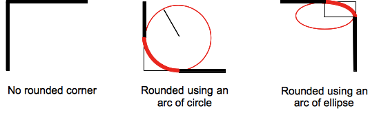 图片摘自:border-radius MDN
语法:
border-radius: [ <length> | <percentage> ]{1,4} [ / [ <length> | <percentage> ]{1,4} ]?若为<percentage>水平半径 = width percentage, 垂直半径 = height percentage;
如果有/,则指的椭圆与边框相切,/前面指的是水平半径,后面指的是垂直半径。
如果没有/,且其值不为percentage 则默认指的是圆形与边框相切,其值就是圆形的半径。
####下面分别介绍下各种情况####
border-radius: radius (只有一个值)设置全部四个方向边框圆角效果。radius指半径。
border-radius: radius1 radius2(两个值)radius1: 上左和下右的圆角半径,radius2: 上右和下左的圆角半径。
border-radius: radius1 radius2 radius3(三个值)radius1:上左,radius2: 上右和下左,radius3下右。
border-radius: radius1 / radius2(椭圆)四个角的椭圆角。
椭圆圆角的其他情况,根据以上类推,不做演示。
border-radius: (first radius values) / top-left-and-bottom-right top-right-and-bottom-left
border-radius: (first radius values) / top-left top-right-and-bottom-left bottom-right
border-radius: (first radius values) / top-left top-right bottom-right bottom-leftborder-radius还有设置单独设置各个方向的圆角。只有一个数值则只圆,两个数值则指椭圆。
border-top-left-radius: <length>  <length>   //左上角
border-top-right-radius: <length>  <length>  //右上角
border-bottom-right-radius:<length>  <length>  //右下角
border-bottom-left-radius:<length>  <length>   //左下角
####Demo####
参考: